
90s Music Album CD Cover and Promotion Poster


This is my pinterest inspiration of grungy type posters. I already knew what album I was going to choose, and I wanted the poster and CD cover to have a sort of distorted, electric-vibe style. At least, that's the type of style I imagined after listening to the entire soundtrack.


The album I was recreating was Oddinary by Stray Kids, a Korean boy band that I have been a fan of for many years. Oddinary represents "all of us who have something odd about ourselves" and the concept "odd things will soon become ordinary". The songs all seem odd-sounding, and may not be to everyone's liking at first, hence the "odd." Despite the strangeness of this album, it is actually my favorite out of all of Stray Kids' discography. I hope to recreate the same oddness and electric feeling that I'm feeling while listening to the music.


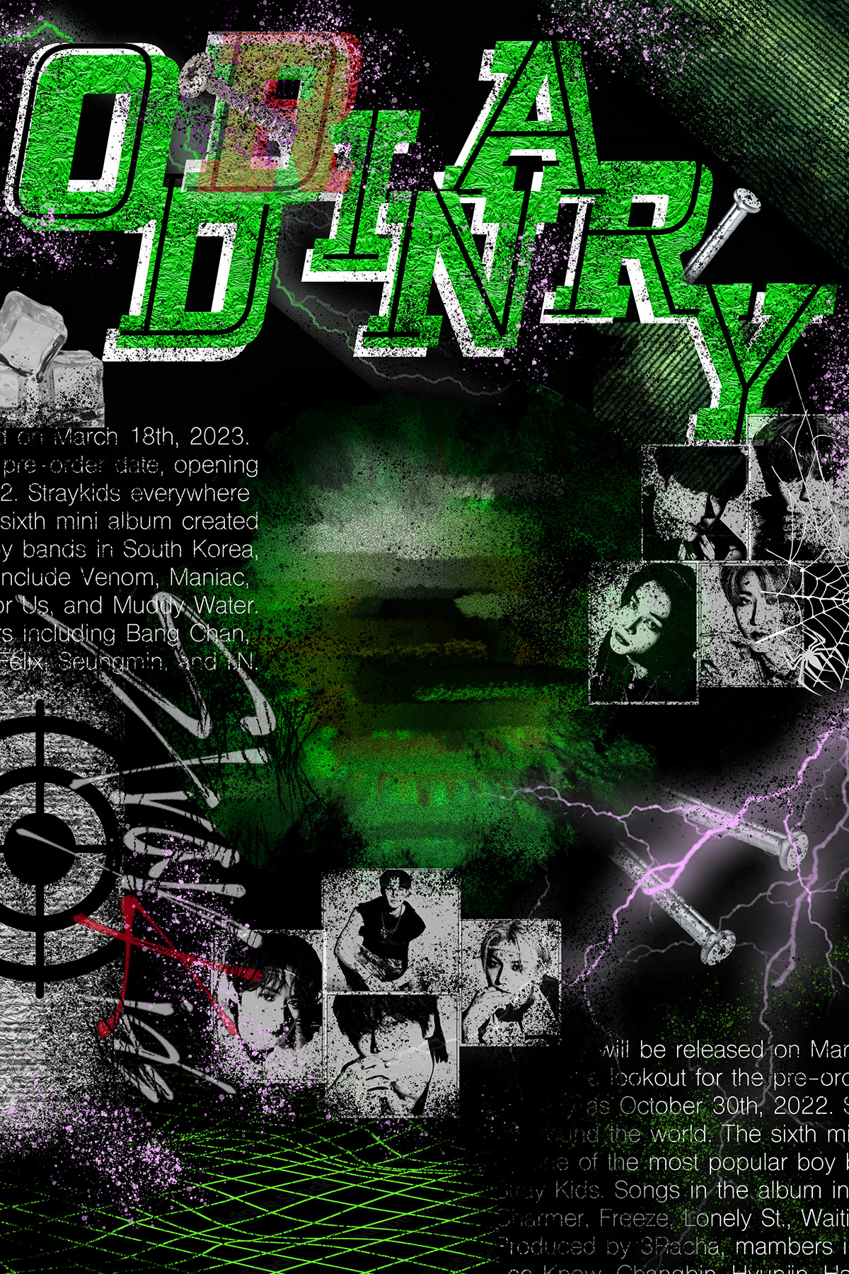
A big focus in this project is type. To start I was sort of just throwing stuff on the board, trying to make the title extremely disorganized yet still legible. The reason why the first D in Oddinary has a red R lightly laid over it is the symbolize the connection between Oddinary and Ordinary. Additionally, I added text in the top left and bottom right, including a lot of information, such as the release date, the names of the members in the group, the songs in the album, and more. This abundance of text in itself is very artistic, providing all the information you need as long as you look into it with close detail. Next, I added all of the members' faces, although I didn't really liked how this turned out at the end. The squares were a bit too rigged to my liking, but I like how the black and white followed the theme of the rest of the board. After that, I added a few references to the songs in the album, like the ice cubes and the nails. To finish it off, I added an eye to the center of the poster. I ended up really liking this because its the first thing that catches your eye when you look at the poster, and its distortion really brings attention to the audience for the rest of the poster. I finished it off by cleaning up the eye, making the entire poster more messy-looking.


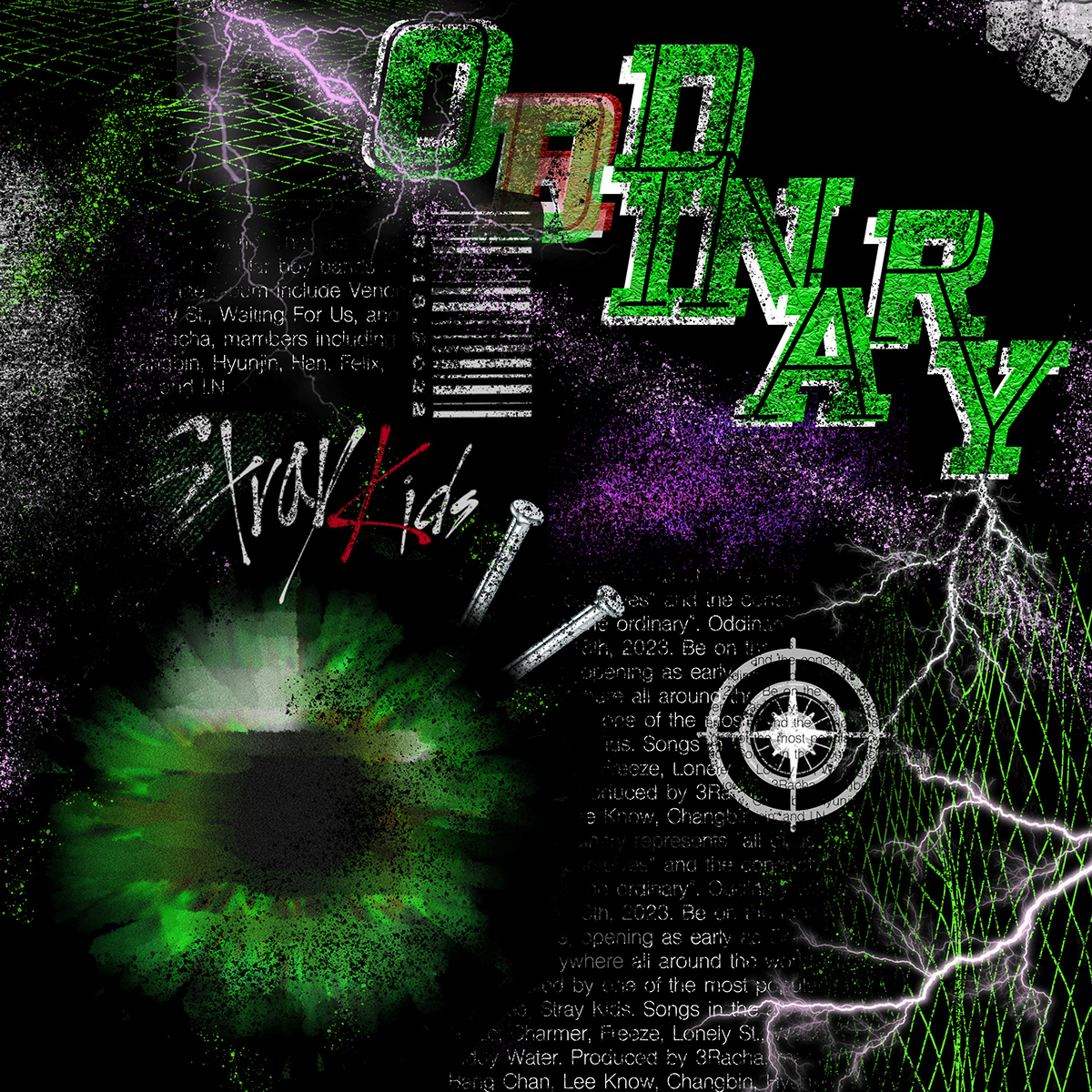
For the CD poster, I wanted a lot of the design elements to match the poster. The main attraction is the eye, so instead of putting it in the center, I had it a bit to the side, which I think looks pretty nice. The toughest decision to make was the title of the album. At first, I wanted to make it a bit different and tried different fonts like a more clean looking one and one where the name of the album is melting, but I didn't really like them. I thought the idea was good, but I felt like it didn't connect well to the poster. In the end I kept the letters style the same as that to the poster. I really like the disintegrating texture throughout the entire design and I think it came out really well. These will be framed and hung up in our school so design wise this is the finished product.

